It is no secret that Guillermo del Toro is one of our age’s best directors and storytellers. From his stunning films in the past, like Mimic (1997) and Crimson Peak (2015), we know that del Toro loves to tell his stories with more than just the screenplay, choosing to tell it through aspects like colouring, lighting, costume design and even the sets in which he films his movies. Here are some fascinating details about the set design of one of his latest movies, The Shape of Water, that you might have missed the first time you watched.
The Shape of Water Set Design
The Mexican director Guillermo del Toro has always shown his intense love for film and storytelling in his movies, and his work in The Shape of Water is no different. Being a romantic movie about a water monster, many people only gave the movie a chance because del Toro’s name was attached to it, but walked away delighted that they had.
From cinematic sequences to the overall look and feel of the movie, every detail counted, and plenty flew under the radar in how his story was told. For those of you who might not have seen the movie yet, The Shape of Water tells the tale of Elisa, a mute woman who lives in a run-down apartment over a movie theatre in 1962. While working as a cleaner in a high-security government lab in Baltimore, Elisa falls in love with a humanoid amphibian creature that the government has captured and wants to study. Can these two misunderstood creatures, who can’t communicate words, find love and their own happily ever after?
Elisa, del Toro, and a Tiny Baltimore Apartment
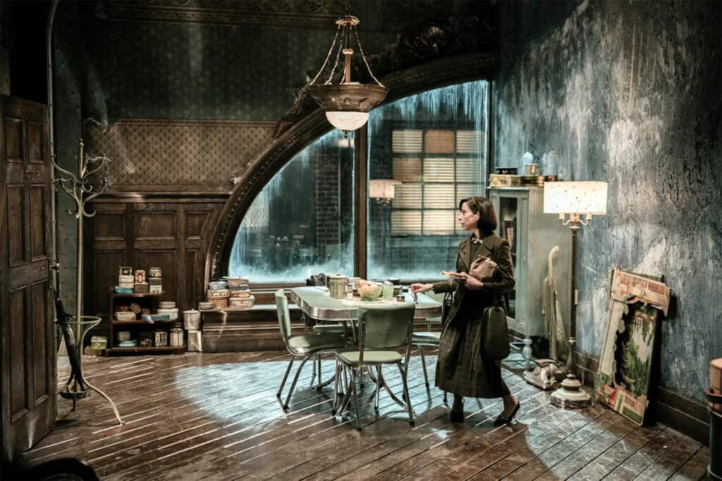
During an interview with Vanity Fair, production designer Paul Austerberry shared some exciting details about just how important the details within and around Elisa (Sally Hawkins) and her apartment were to the story of The Shape of Water.
As mentioned above, Elisa finds her home in an apartment above a movie theatre in the 1960s. She has a routine: waking up in the morning, boiling some eggs to pack in her lunch, ensuring her neighbour and friend Giles have a meal, and scurrying off to work. Being mute limits her social interaction. She doesn’t seem to mind her quiet existence.
The picturesque movie theatre, with its lights and voices that travel through the floorboards, is symbolic of her very existence, viewing other people from the outside and never really feeling like she belongs. This idea of never genuinely belonging is only increased by her apartment’s layout, lighting, and décor.
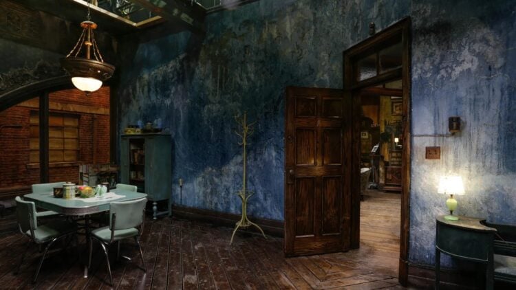
Small details like the dirt on the windows, the sparseness of her furniture, and even the colour of the lighting in her home all work together to tell a story. The stunning arched window looks out onto the streets of Baltimore, like a fish looking out at the rest of the world from within a fish tank.
Screen Daily chatted to cinematographer Dan Lausten, who worked with Guillermo del Toro on his 1997 and 2015 films. He was charged with using angles and lighting, highlighting that Elisa has been living in her own little world, much like a fish does within their tank.
Lausten shared that the colours of the apartment, the costumes, and the film itself were essential details to del Toro that had to be perfect.
“Guillermo is very particular about his vision, and what kinds of colour he wants. Greens and blues were chosen to represent water, red was brought in for life, love and death. And then we focused on shadows and contrasts.”
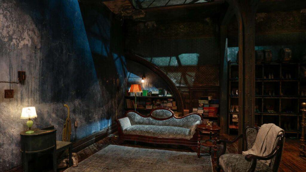
The lighting throughout her apartment is always cold, with blues, greens and steel grey making up the colours and lighting within her home. With wood textures that are cold rather than warm, her aluminium and blue dining set, and lastly, Elisa doesn’t even have a bed in her apartment.
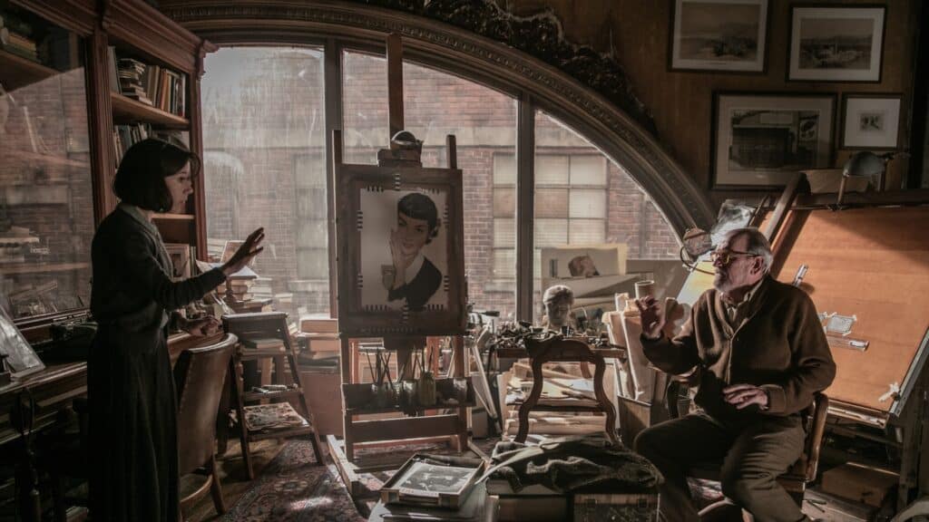
In contrast, Giles’ apartment was a mirror of Elisa’s own space, filled with art and clutter from the long life he lived trying to fit in with the rest of the world. With everything from pets to protect him from loneliness to TV as a way of looking in on the rest of the world rather than just through his windows, he can barely reach because of the clutter. Giles’ apartment is filled with warmth and uses warm lighting throughout as a contrast to the steel-cold lighting in Elisa’s.
Golden light is only ever used once in Elisa’s apartment, and it is the scene where she and the aquatic creature fall in love. Lausten said to Screen Daily, “The only time we have golden light in Elisa’s apartment is when she’s falling in love with the fish.”
Giles, her neighbour and trusted friend, has a Murphy bed in his apartment that he pulls out and packs away as needed. Still, Elisa sleeps on a vintage couch surrounded by books in her sparse living room. Although she doesn’t seem to mind, this further shows that Elisa isn’t meant for this world, sleeping on a couch in her home.
RELATED: Fantasy & Futuristic – The Earth-Conscious Homes Of The Future
From some angles, the paint and décor in Elisa’s apartment could easily be missed or misunderstood. At first glance, the walls almost seem dirty because of the lighting, like a seldom-cleaned fish tank. Still, the actual design is rushing waves that were painstakingly painted by the production team. It shouldn’t be a shock that the movie has much to do with water. Still, the real point was a hint that Elisa was destined to join her aquatic lover in the water. While the human world might never have been a place for her, she would eventually find her place at his side.
Details That Represented del Toro More Than Elisa
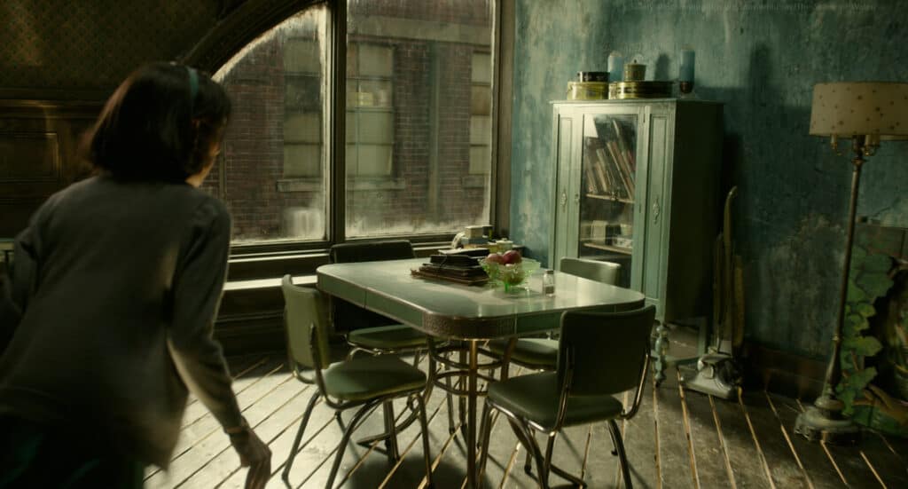
Guillermo del Toro is one of the biggest film nerds you will ever hear of, to the point where he pestered Austerberry until he would include a symbol from The Red Shoes (1948), one of del Toro’s favourite films and a classic British drama starring Moira Shearer. The arched window that spans Elisa’s and Giles’s apartment is inspired by one from the film, a detail del Toro wouldn’t make the movie without.
Despite having been set in the 1960s, del Toro requested that the whole film be lit and shot like it was a movie from the 1950s, once again highlighting his love for the classic film era that pioneered how he was able to bring his own stories to life.
Another small detail that could easily be missed is how Elisa stores her beloved shoes. A woman of simple pleasures, Elisa takes incredible care in looking after her shoes. Clearly, her shoes are a way that she expresses herself and her sense of style, and an essential item to her. Her apartment is littered with beautiful items that help her maintain her shoes. Still, the way she stores her beloved shoes is exciting. Elisa stores her shoes in attractive racks designed to hold film-reel cases instead of a cupboard, shoe box or trunk.
The reason behind this could easily be explained as being available to her because she moved in above a movie theatre. Still, critics think it has more to do with Guillermo del Toro’s love for film. With this simple detail and décor item, the worlds of reality and fantasy converge, as del Toro and Elisa’s loves, film, and shoes are brought together.
Guillermo del Toro initially planned for the entire movie to be filmed in black and white to bring his vision to life but settled for a single fantasy scene where Elisa could talk and sing. She dances with her creature and shares her love for him, knowing she might soon have to say goodbye. The scene was shot in colour, and the colour was digitally removed. Still, the fantasy theatre set created for the scene was just for del Toro’s delight.
RELATED: The Notebook House – An Icon of Cinema Romance
Do you know any fascinating details about The Shape of Water set design that we missed? Let us know in the comments below!

